How are colors rendered?
Recently I’ve been looking into better color rendering for some of my side projects and I ran into some new CSS primitives I’ve never heard of - OkLch and Oklab.
I know a little bit about Oklab colors - that they’re somehow supposed to be “visually appealing” for video games and art - but not much else.
My side project - https://gamingwrapped.com had a ton of really aggresive eye-hurting colors so I began digging! This blog post describes what I learned.
An introduction: RGB vs. HSL
When I first learned HTML & CSS - I learned about RGB(A). The simplest color system ever for a machine to understand. Just 3 numbers - red blue and green. This essentially gets piped directly into pixels in screens and the combination produces a color for the human eyeballs.
Now, it turns out that this format is really good for machines to render colors, but its not really good for:
- Developers who want to be able to look at a number and tell what color it is.
- Modern OLED displays can actually render more colors than the normal rgb colorspace can represent.
The HSL color system is reasonable at solving the first problem.
It turns out it is very convenient to represent colors in modern design systems with semantic naming such as “primary”, “action”, and “accent”. It turns out you can actually create these colors mostly programmatically simply by being given a color - this video does a phenomenal job explaining it.
HSL stands for Hue, Saturation, and Luminance. Conveniently, “Importance” of UI elements can be displayed to the user by modifying Saturation and luminance. This reduces the number of “knobs” to just the hue - which represents an angle on the color wheel ( a color )
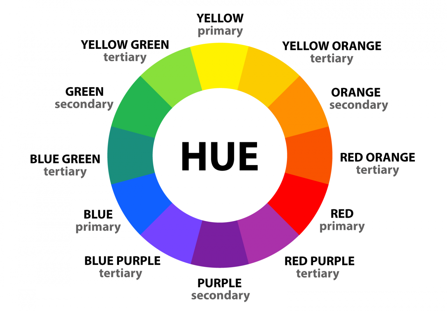
This system dramatically simplifies colors for humans because its much easier to be able to comprehend a color just by knowing the hue (and having a poster of the color wheel up on your wall).
This blog post goes into more detail.
What problem does OkLch solve?
So, it turns out that while HSL is really good for developers and designers, it doesn’t actually necessarily improve usability of colors for users. It also does not take full advantage of modern HDR and OLED screens.
There is also the additional advanced problem which is that the human eye can perceive saturation and luminance well for some hues more than others. For example, 10% luminance will yield dramatically different results for blue vs purple.
OkLab and okLch add more colors and use them to smooth out this deformity:
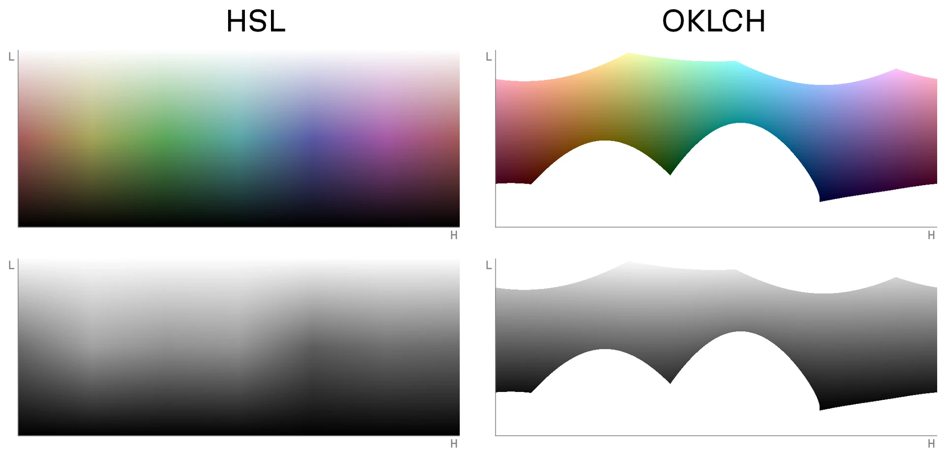
You can access this better gamut in LCH which represents Lightness, Chroma, and Hue. Hue is the same as HSL. Chroma is similar to saturation, but there is some math that happens under the hood to be smart about the color that gets rendered. The L is lightness, which is also analogous to luminance.
Another benefit to this system is that oklch colors are modified by filters and such in a more predictable manner because the color space is smoother than HSL with respect to the human eye.
Conclusion
And there you have it! A modern solution for a modern problem. Thanks to the smart people who invented this system, we now have a system to produce much better colors for usable apps.
Is it a bit boring? Maybe.
But at least for tools, boring is good!